OJIO
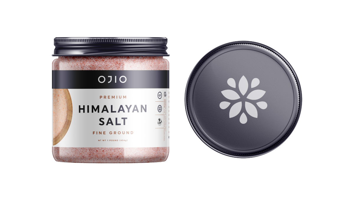
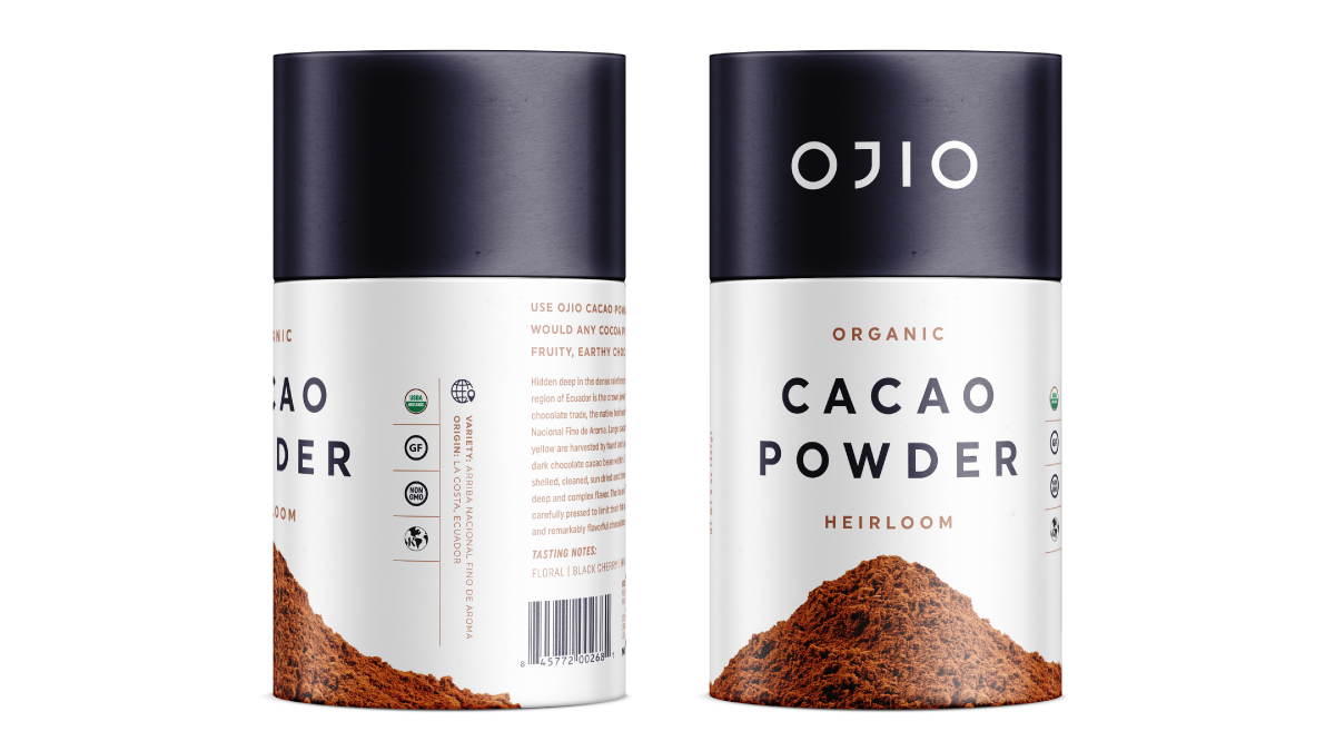
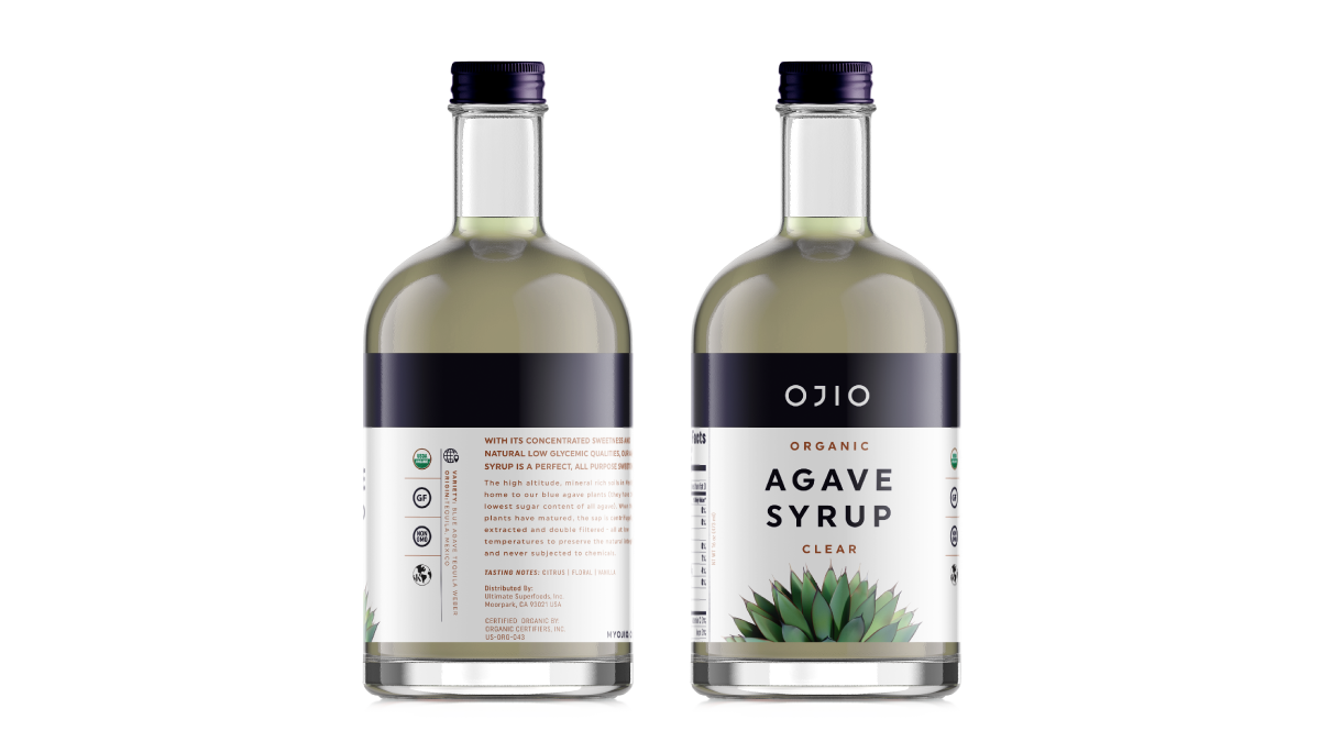
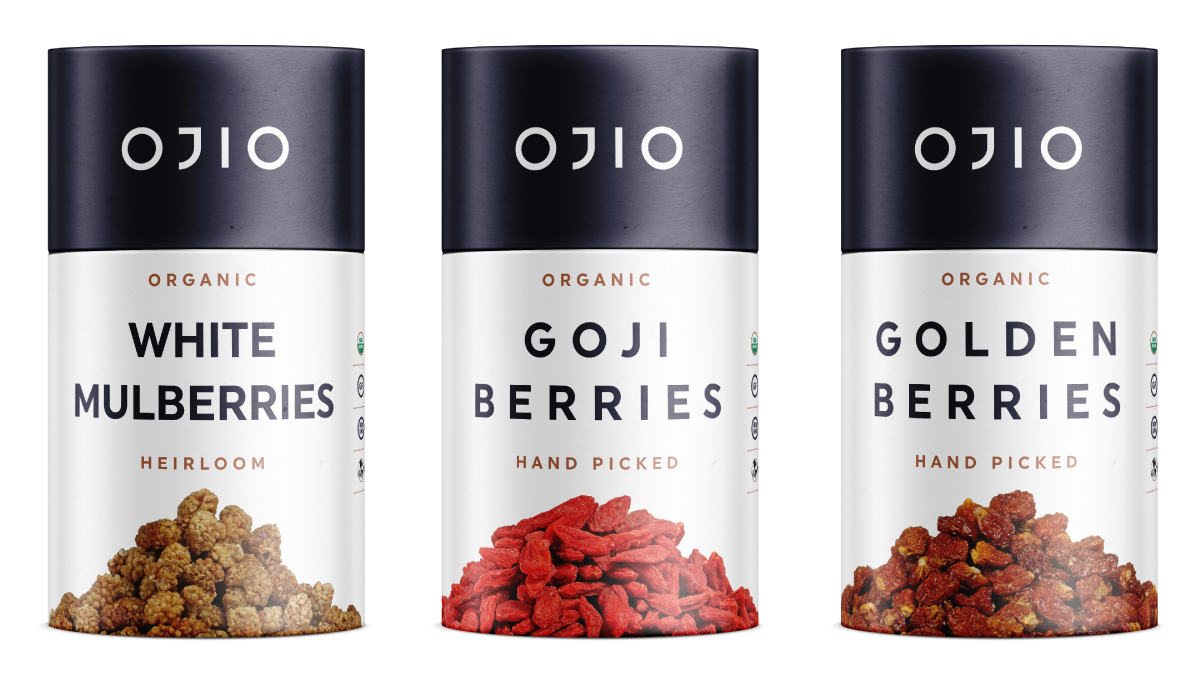
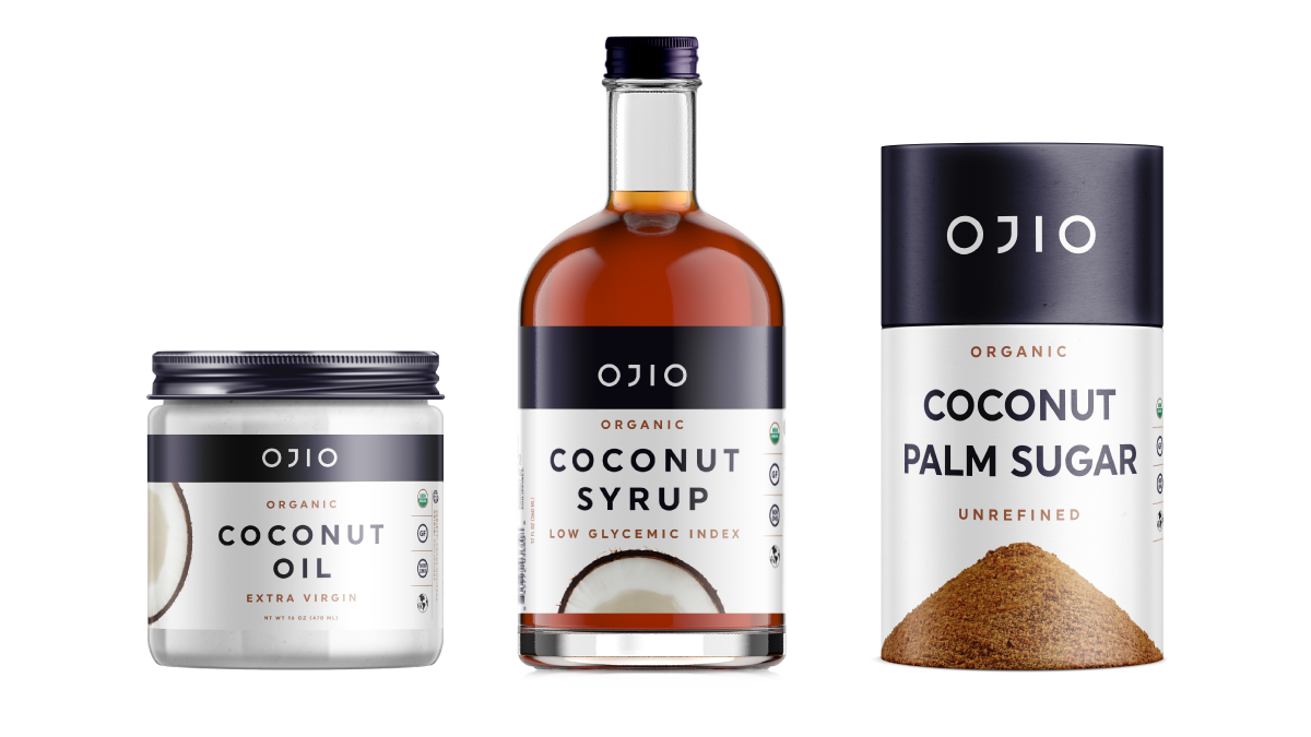
Originally, OJIO's packaging, with its bohemian vibe, did not effectively communicate its main selling point: ultra-premium ingredients. Identifying an opportunity to highlight our superior position in the competitive superfood market, I led a comprehensive packaging overhaul to distinguish our brand.
project_specs
tools
illustrator photoshop
role
creative_director
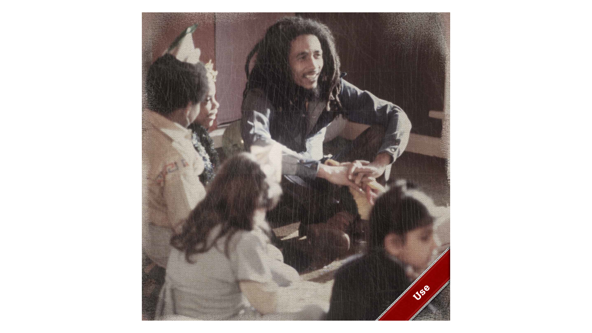
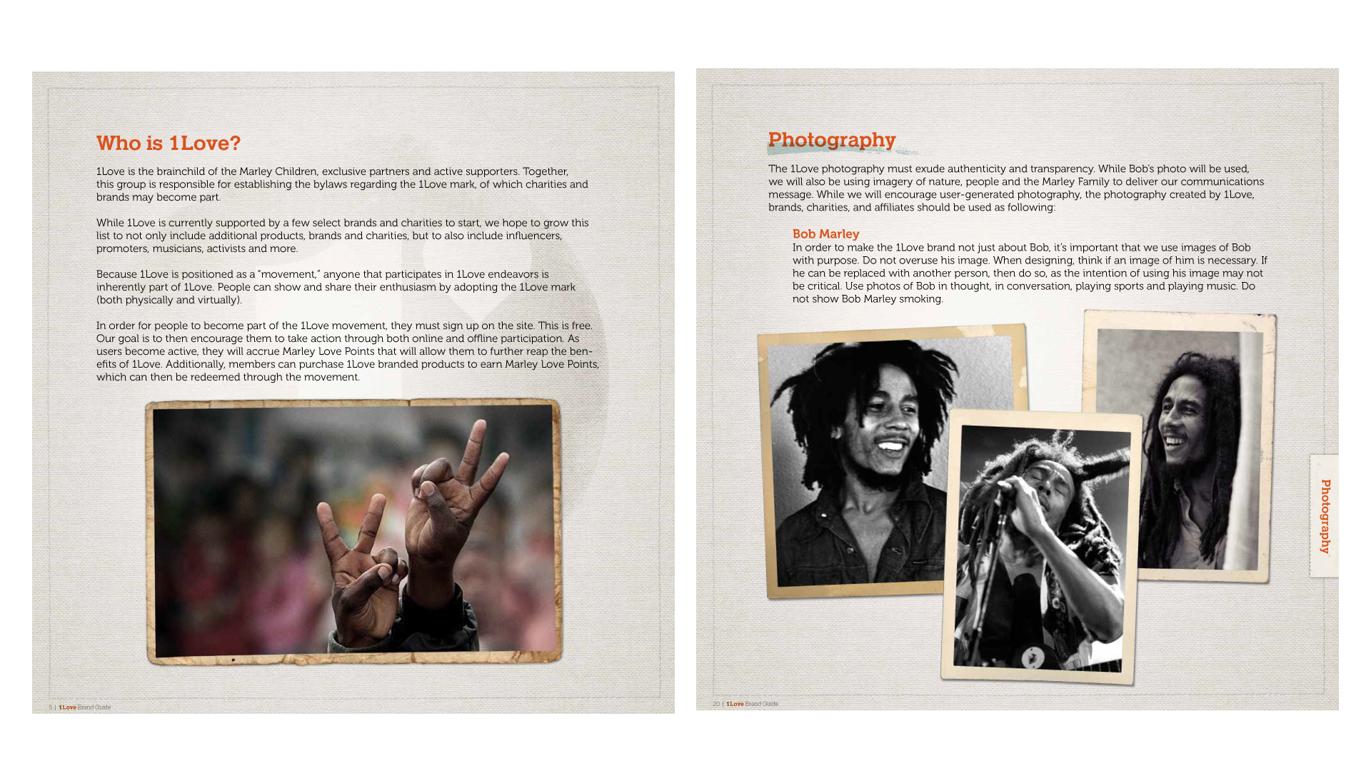
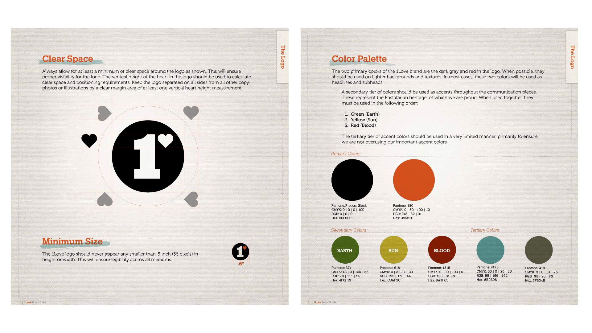
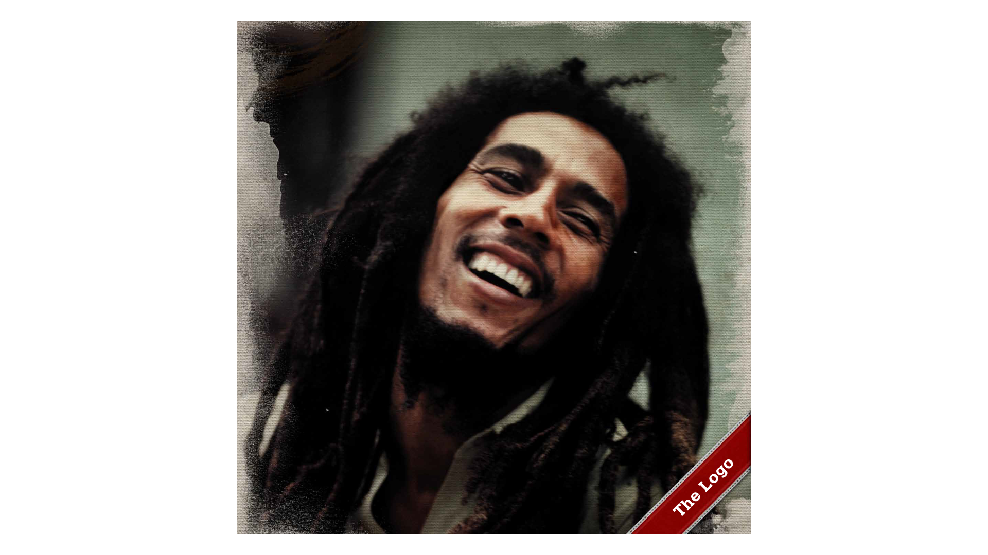
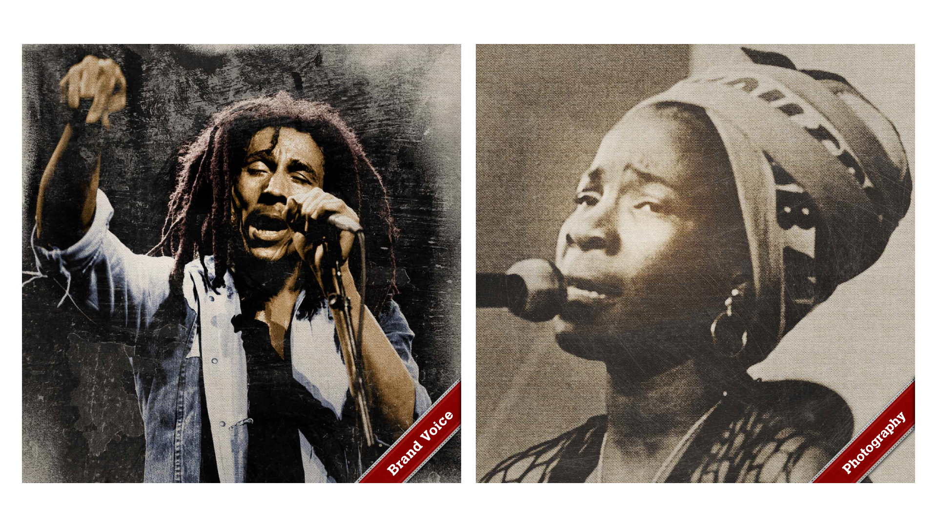
Bob Marley Estate
I was thrilled to get the opportunity to work on this project. The Marley family wanted robust brand standards for the new 1Love foundation. I produced a set of print standards covering all use cases and guidelines. Superb photos, incredible subject matter, and an awesome cause, these are the projects that keep the fire lit.
project_specs
tools
illustrator indesign photoshop
role
art_director
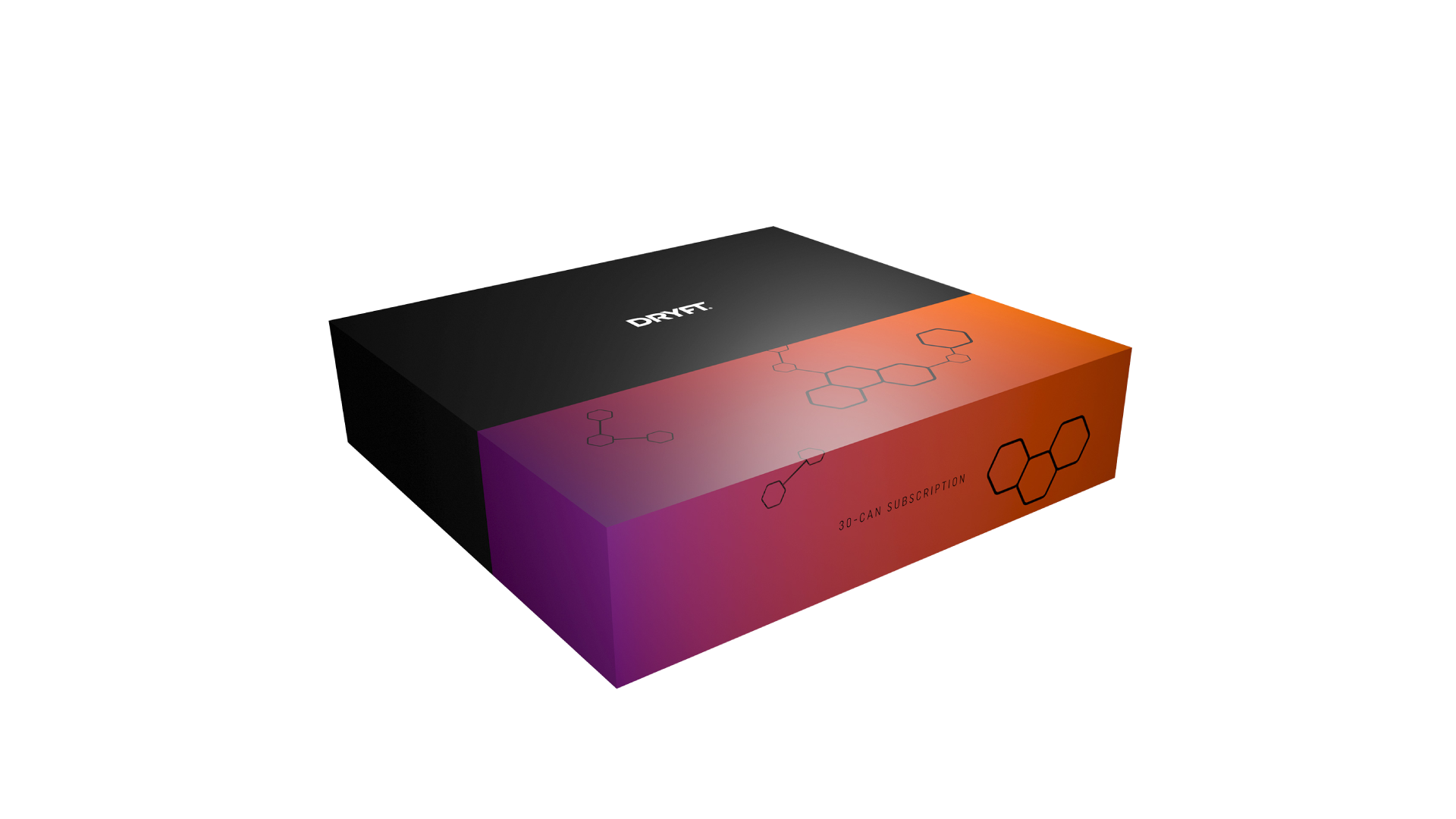
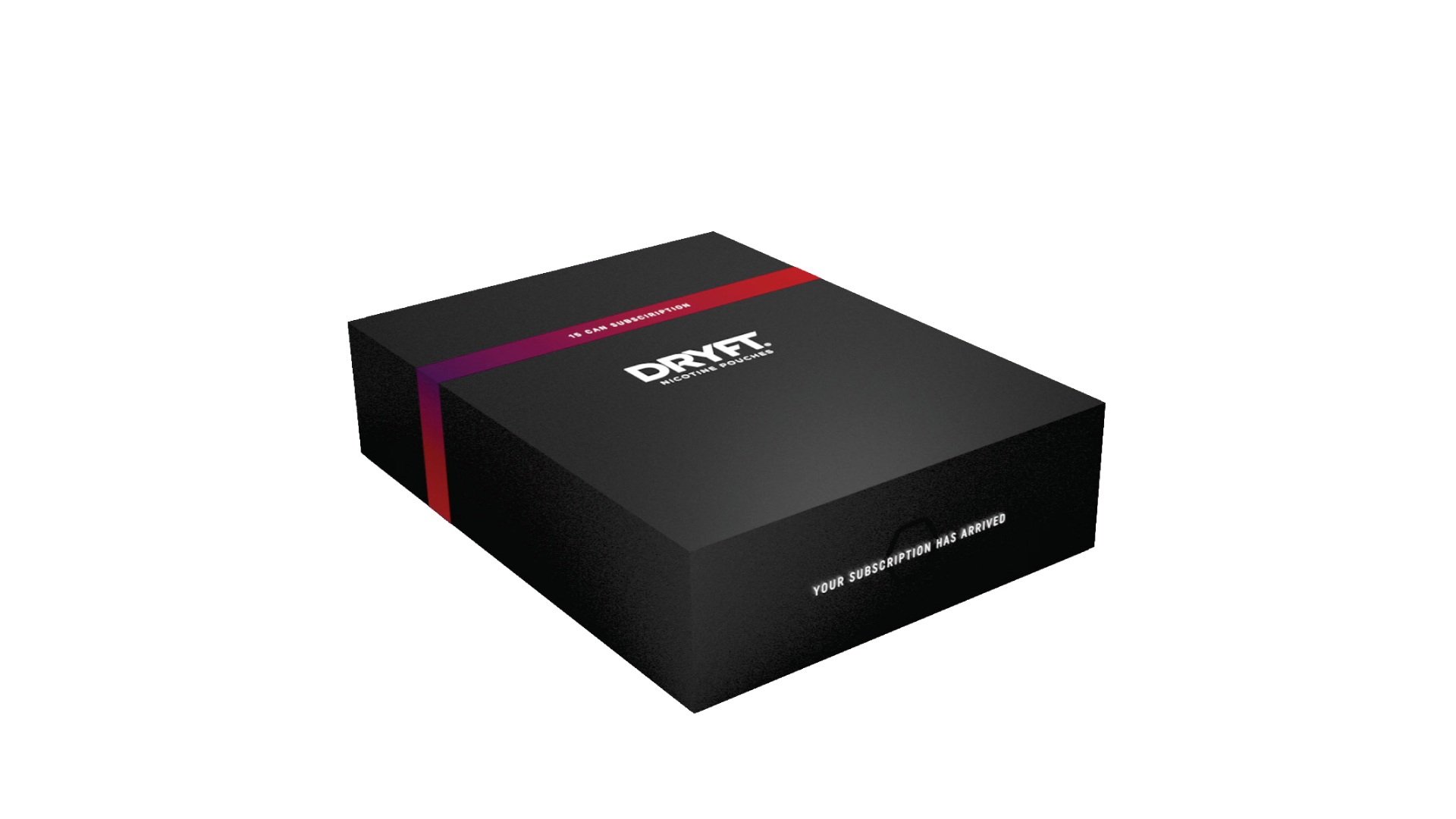
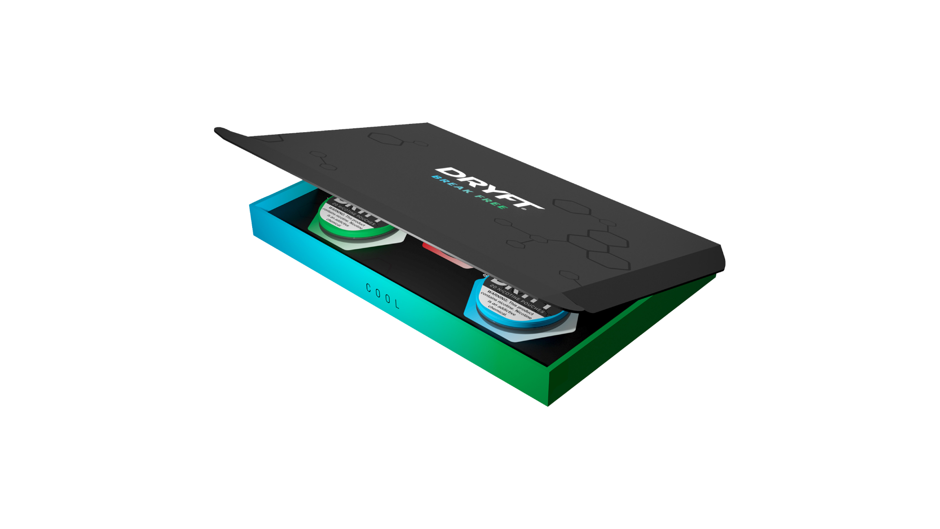
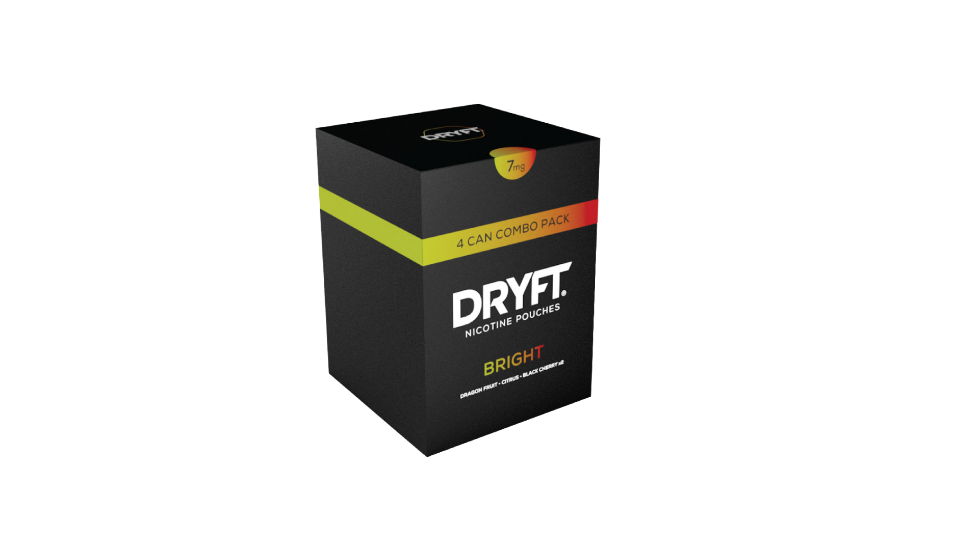
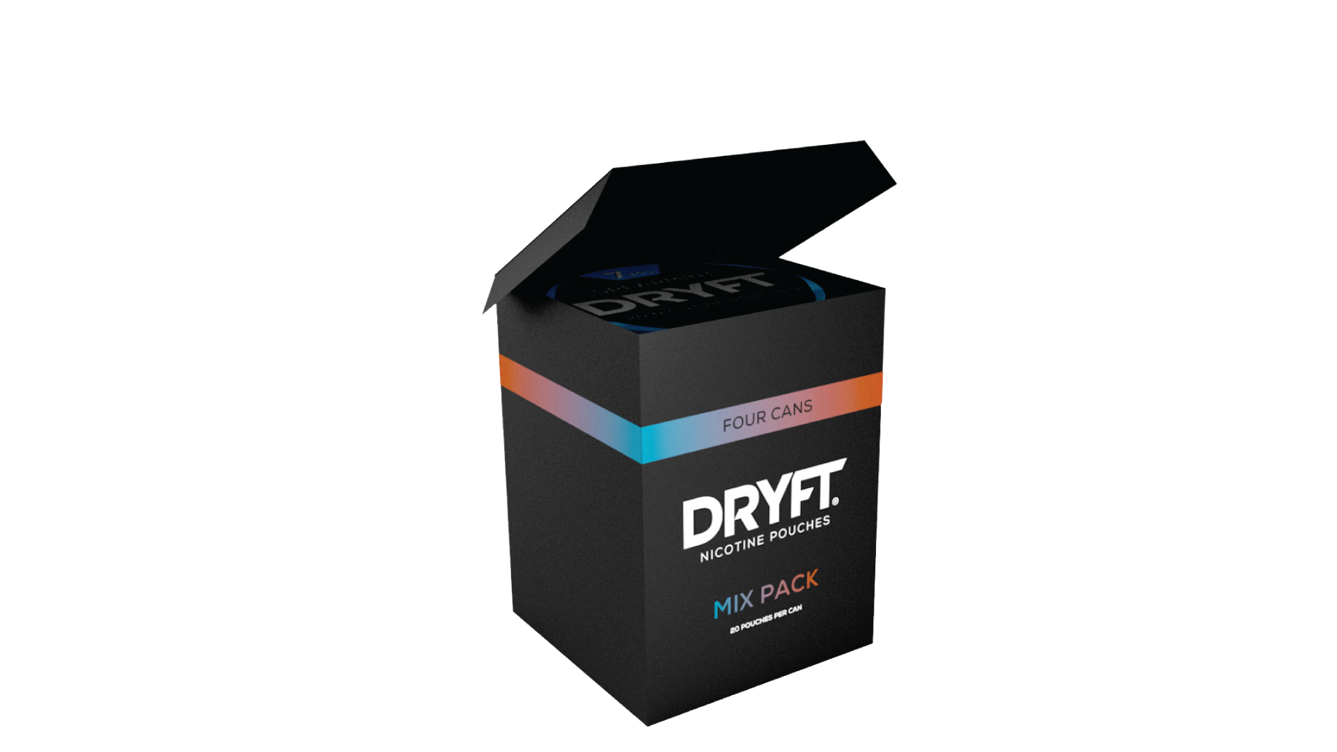
Dryft
DRYFT was a cleaner, safer nicotine product lost on the massive tobacco shelf. The goal was to create packaging that highlighted this modern, clean product. Bright colors and gradients cut through the traditional "cowboy" feel in the market.
project_specs
tools
illustrator indesign photoshop
role
creative_director
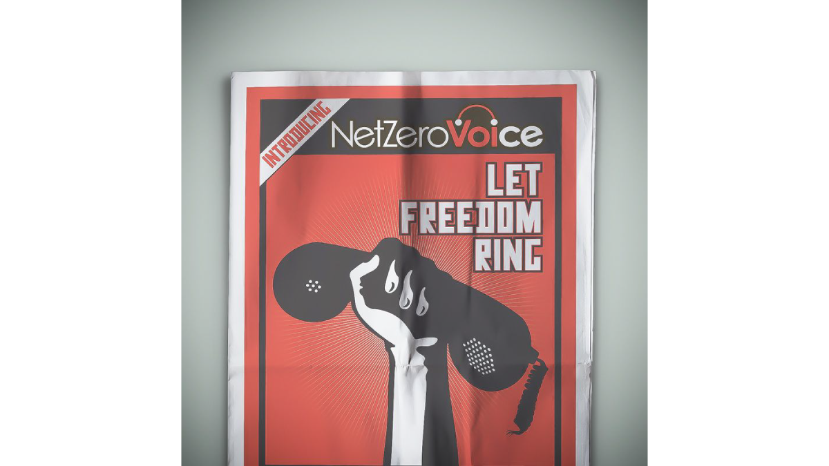
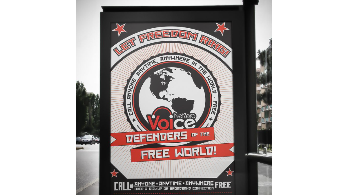
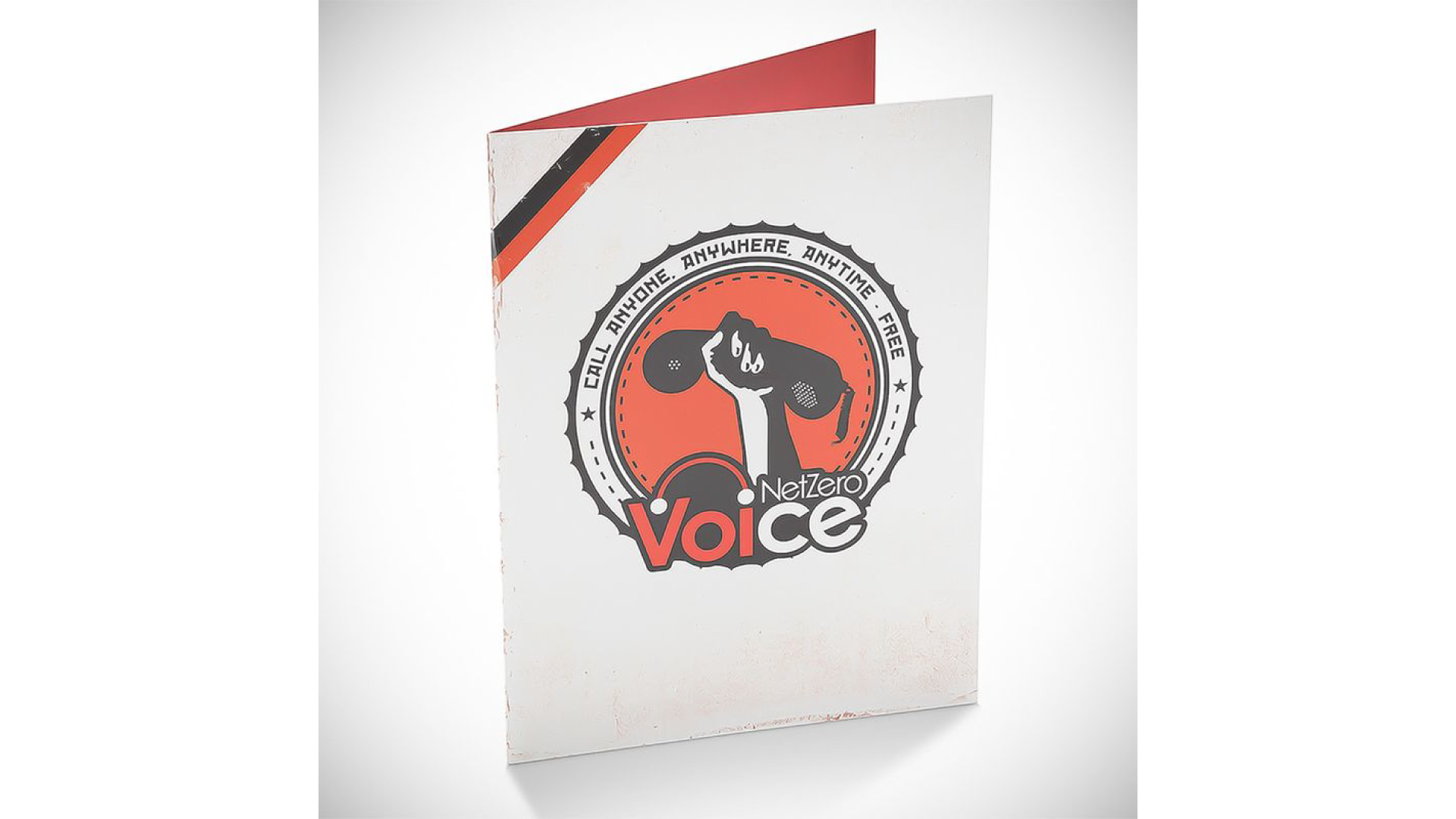
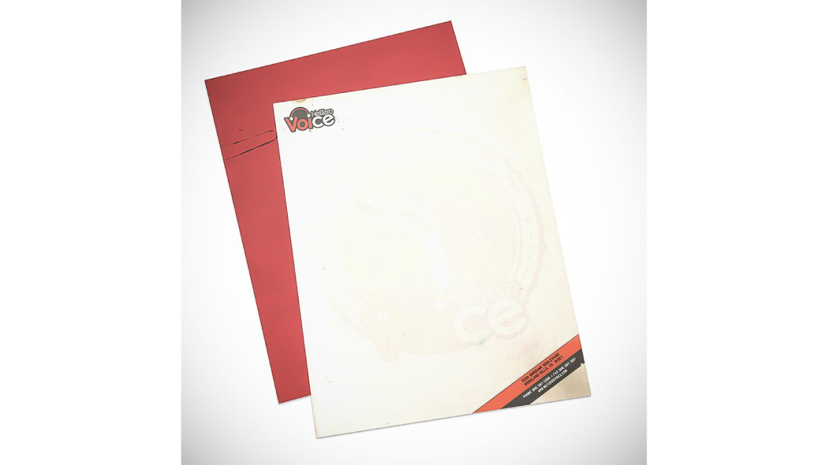
NetZero
When NetZero decided to get into the VoIP business, they wanted to recapture the original “defender” concept they used at launch. We spun that idea into a play on political propaganda materials. NetZero launched with everything from posters and 30-sheet billboards to full-page ads in USA Today. The product was short-lived, but the launch campaign generated much buzz.
project_specs
tools
illustrator indesign photoshop
role
creative_director